The Old Scotch Collegians celebrate their 125th anniversary in 2017, and commissioned me initially to illustrate buildings around the campus in a 'vintage travel poster' style. Working through the brief, it became evident that the posters needed to also capture the stories of collegians and the brief was expanded to produce a series of posters that were snapshots of life at the college. This required liaison with the school's archivist and Collegian anecdotes to accurately reflect the rich history of college life. The poster take their place in the college's new exhibition space in the Memorial Hall, and the artwork is also being applied to other collateral produced by the college.
Antz Inya Pantz engaged me to rebrand their Cold Brew product to reflect the hand crafted nature of producing the brew, and the maturity of the brand as a premium, quality product. The campaign included the development and delivery of the Cold Brew bottle labels, custom lettering, brochures, countertop posters and social media content.
Originally approached for a new uniform design, it was through development of the brief that challenges were identified with the existing logotype. Rebranding allowed the choir to increase their visibility during, and in between, performances. The choir loved their uniform so much that they approached me to undertake a complete branding campaign including the supply of business cards, banners, concert programmes, social media EDMs, concert photography and videography.
Craig Steere Architects is a boutique design practice in Perth. For the practice’s 20th anniversary, I refreshed their existing brand identity, including a new logotype and style guide. The design philosophy of the practice places emphasis on high-quality design and workmanship and this characteristic was carried through to the visual language across their collateral and marketing campaigns in both digital and print applications.
I am responsible for the supply and delivery of various marketing collateral, such as signage, EDMs and print advertisements. I am also the copywriter for articles and project submissions, and the main liaison for media and journalist enquiries.
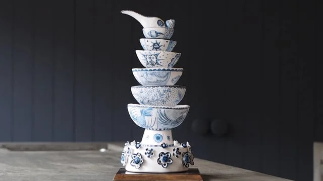
Bowl Pagoda is a Ceramic artwork by Vipoo Srivilasa. The work is a private commission that celebrates and captures the unique love story of its owners and, like the piece itself, contains symbolism and stories that reveal themselves through the deconstruction of each layer. I shot this promotional video for the owners to share the piece with their family and friends overseas.
Nostalgia Box is a retro video game museum in Perth that has an interactive area where visitors can play on older video game consoles. I was approached to design promotional DL flyers and event posters for their venue hire packages. The artwork references 8-bit pixel art, a feature of vintage console games.
Antz Inya Pantz approached me to refresh their branding to better reflect their market position as a quality, premium coffee bean supplier while balancing their relaxed work culture and sense of humour. The rebranding included a new logotype (which included a hidden Antz head referencing the previous ant mascot murals), sub-branding for each of their stores, style guides, EDMs, brochures and exterior signage.
BLOX is original concept that utilises Ceasarstone to create a unique object- in this case a light fitting that can be manipulated in a playful manner- to produce different shapes and forms. A collaboration with Craig Steere Architects for the object design, I was responsible for creating the visual identity for the BLOX concept, including the logotype and concept booklet.
EMC Physiotheraphy had established a business relationship with a local gym and required a DL flyer and roll-up banner designed to promote their physiotherapy assessment service offering. The design took cues from the existing branding colours and included sourcing photography, typesetting and illustration of a location map.
I was engaged to undertake a marketing campaign for Edney's Super Fete- a fundraising event by the Parents & Citizens Committee. The event was a super hero-themed fete and I was responsible for producing all the collateral surrounding the event including posters, signage, social media spots and liaison with local newspapers for article placement.
Edney Primary School is a suburban public school with 400 students. As part of the school’s application for Independent Public School status, I was contracted to raise the professional standard of the school’s internal and external publications. This included design and illustration of the school's information and study plan brochures, flyers and various marketing collateral
Interior Designer Carla Thomson wanted a brand that would reflect her personality, and her design approach which is detailed oriented and rich in narrative. Carla had a clear vision of a line portrait to represent her branding using a specific blue (which we named 'Carla Blue'). A brand system based on her facial beauty marks creates a scalable icon system to showcase her work and a custom typeface embedding a hidden face in the logotype reflects the quirky details often found in Carla's work.
My niece and nephew had just turned two, and were still learning how to refer to their family members. For Christmas, I wrote, illustrated and produced a thick boardbook about the family members and their hair. The book has become a cherished bedtime ritual, and two years on, the kids still greet me at the door with “uncle Kel, you have thick hair!".
HIT Japan is a multifaceted company producing homewares and consumables for the Japanese market. I was commissioned to illustrate Nordic style motifs to be transferred onto plates. The relationship so successful that the client subsequently licenced a number of my existing artwork for cushion covers as well as commissioning new designs.